A4 format
Leaflet 1
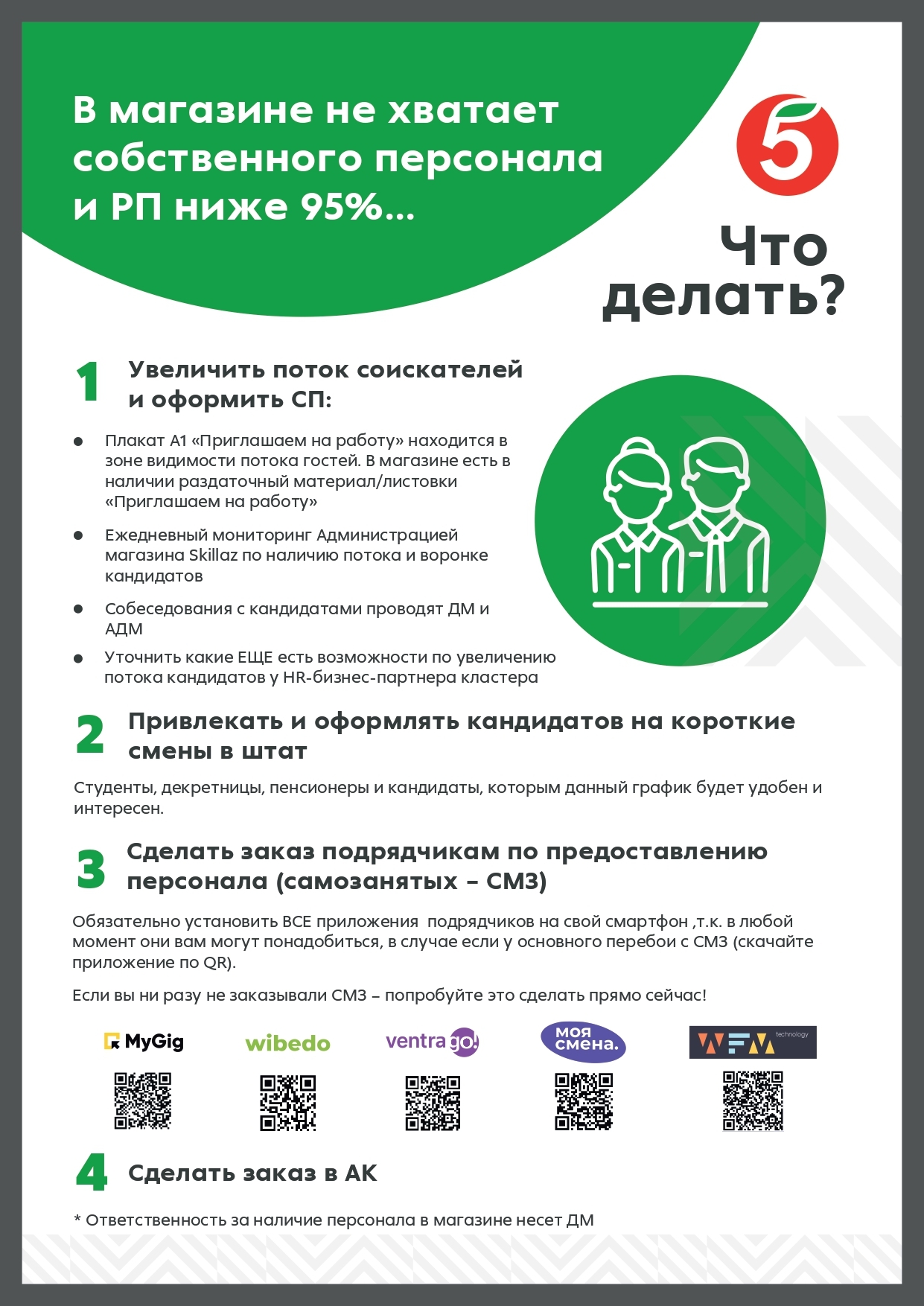
The leaflet is the subject of informing the store administration how to correct the situation with incomplete staffing. A leaflet without complex design elements, with a clear understanding of step-by-step actions in this case.
Leaflet 2
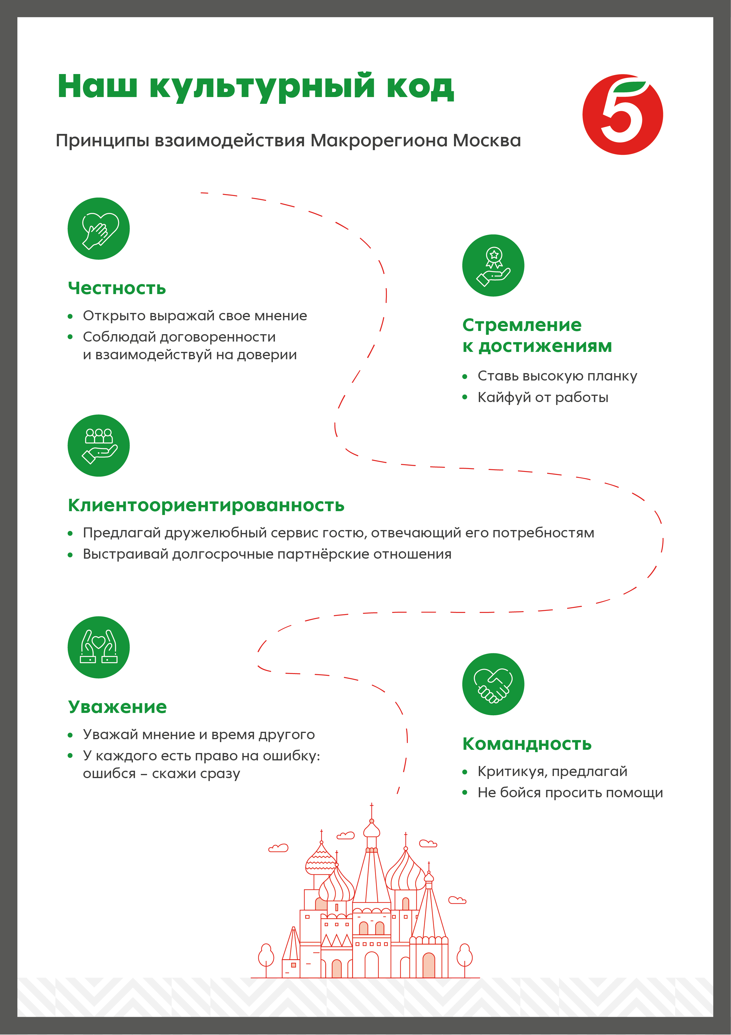
Structuring information about the principles of work in the Moscow macro-region, emphasizing values and explaining them in a soft way. A leaflet for office employees. The leaflet is not overloaded with text and graphic elements.
A4 format
A4 format
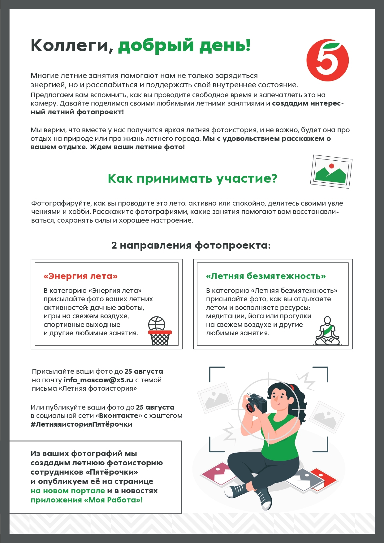
A leaflet about the summer competition for online mailing to employees of stores and office. The design of the leaflet attracts attention and engages, makes it clear how interesting it is to participate in this competition. Also, the attention is immediately attracted by the block with gifts to the winners.
A4 format
Leaflet 3
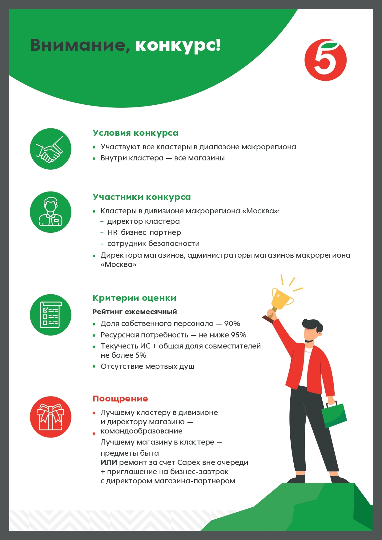
A leaflet to inform about the start of the competition for employees of "Пятёрочка" stores. The terms of the competition are simple and clear, written clearly and structured. The design of the leaflet attracts attention and engages in participation.
Leaflet 4
DESIGN OF LEAFLETS
AND POSTCARDS
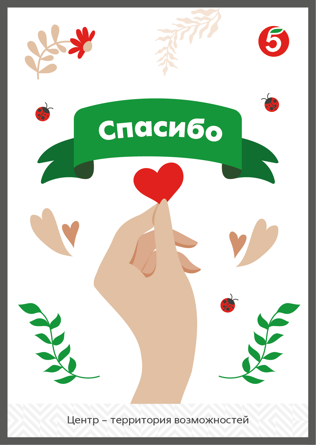
The "Thank you" card is an addition to the souvenir set. It evokes emotions of emotion and emphasizes the value of the employee and his involvement in the project. The design is not overloaded with unnecessary elements. The main purpose of the postcard is to say thank you.
A5 format
Postcard 1
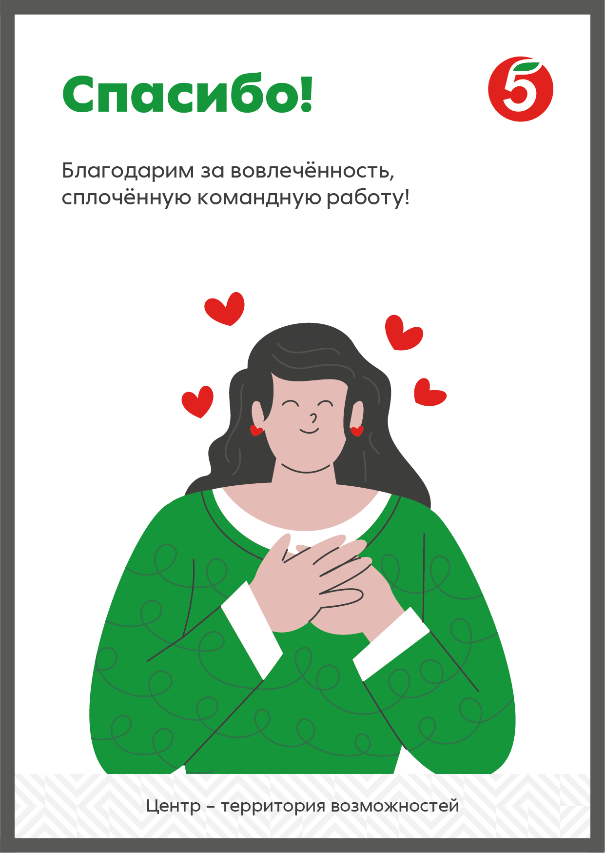
A5 format
The "Thank you" card is an addition to the souvenir set. It evokes emotions of emotion and emphasizes the value of the employee and his involvement in the project. The design is not overloaded with unnecessary elements. The main purpose of the postcard is to say thank you.
Postcard 2
“Пятёрочка” is a Russian chain of grocery stores. The company gave the task to develop several informational materials, namely printed leaflets and postcards. All materials were intended for the company's employees and were supposed to attract attention. Flyers and postcards are designed based on the brand book of the company. Each design layout contains a logo, a corporate pattern and corporate colors. Developing the illustrations, I used different shades of the main colors of the brand.
